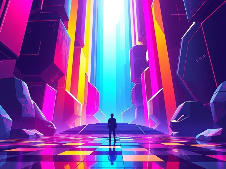
Color in games is far more than visual appeal—it’s a core part of design communication. Through color theory, developers guide players, create emotional tone, and signal information without words.
In Portal, color directs mechanics: blue and orange portals, contrasting test chamber highlights, and clean whites convey a sterile, futuristic space. Every shade has intention. Blue is often tied to trust and logic, while red signals danger or urgency.
The Legend of Zelda: Breath of the Wild uses warm tones for safe zones and cool or desaturated hues for mysterious or dangerous areas. This establishes intuitive navigation. Players associate golden glows with shrines or rewards—no tutorial needed.
In DOOM Eternal, color supports clarity in high-speed combat. Enemies flash a specific color when they’re vulnerable. Pickups have distinct color coding—green for health, blue for ammo. This color system reduces cognitive load in chaotic encounters.
Games also use color for emotional impact. In Gris, the world gains color over time, reflecting the protagonist’s emotional journey. Color becomes narrative, not just decoration.
Principles of effective color use:
- Contrast to highlight interactables
- Harmony to reinforce setting
- Saturation to create urgency or energy
- Desaturation for bleakness or calm
When color is consistent and intentional, players understand the world faster, feel more immersed, and make decisions instinctively. Great color design speaks directly to the subconscious, guiding without overt instruction.

Leave a Reply